casa-calida-lointerior-lorena-olmos-wall-brick

THE SIDE B OF INTERIOR DESIGN: BUDGET

Among the biggest problems that arise at the beginning, in the meantime and at the end of the work, is the issue of money. It is important to be aware of the budget that the client has in mind to invest, but in turn, it is the same or for me it is much more important to comment that there is a percentage where the budget can be increased and let the client know from the day one, because as much as we would not like to, there are modifications, unforeseen events and things that are not in our hands and that increase the final expense of our intervention. It is a sensitive topic, since we are talking about investing and knowing how to organize the money of third parties, and it is something that complicates us as architects, either because we “fall in love” with our project, because we are foolish and put our ideas on the economic ease of the client, so here are some tips that I use when I run into a wall on site and not to lose the integrity of the proposed concept.

STAGES

There is no need to carry out the entire work in a single moment, we know how heavy it is to be living on site, and if you can and if you have patience, it is much better to intervene in stages, letting the family or the space breathe everything that is the intervention and resume at the moment in which there is economic flow, at the end of the day, no matter how long the work takes a year in between, the important thing is to carry out a project that lasts a lifetime, without having to sacrifice a huge percentage of what is desired for your design. It is important to present this idea to the client from the beginning, so that they do not start rejecting the ideas from the moment we are presenting them, I have experiences where I am presenting a project and the only thing the client sees is the economic part and the comments of “But that looks very expensive, how much is it going to cost me?”, “Isn’t there a cheaper option?”. The issue here is not to lower the quality level of a project, not to reduce the project for economic reasons if the issue is to carry out an intervention that lasts a lifetime.

SUGGESTIONS

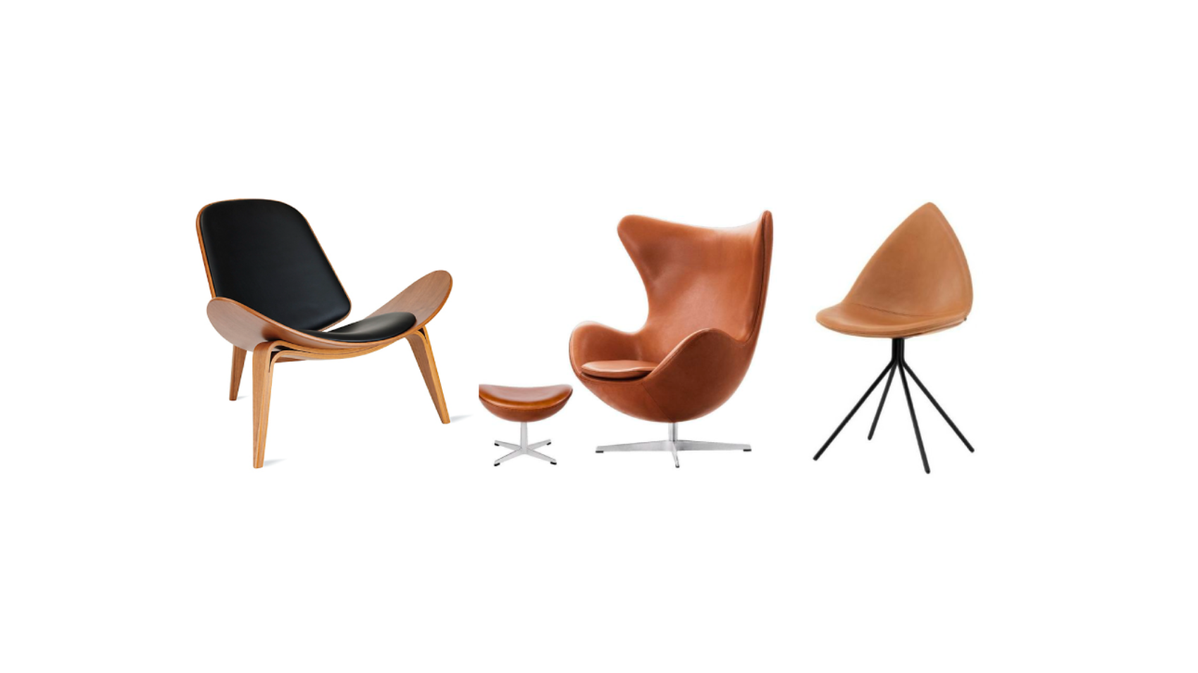
It is understandable that the client wants to look for offers, or in his case a slightly cheaper version of the product that we are specifying, personally when these request cases exist, I select three different options, with prices from lowest to highest, where the space continues with the necessary integrity so as not to lose in terms of design, but at the same time trying to accommodate the budget. But the most important thing about this, is to try to keep the client on that topic, as much as she wants to buy some 25 dollar chairs, while you are proposing 120 dollar chairs as the economic version, it is for something, and that ‘ something’ you have to know how to transmit it to the client. If we talk about maintenance, materials, durability, the lifetime of that $25 chair is not going to be less than 2 years, it will look and feel of poor quality, and if an investment is already being made, it is a lot. It is better to save and buy the 120 dollar chairs that will last much longer and that are most likely to have a guarantee.

LISTEN TO THE CUSTOMER

If from the day your client arrived at the door, he let you know what his budget was, and even so, you offered him onyx on all the walls, the mistake is in you. We must learn to listen to the people who hire us, because they do it not only because they want a design, but because they are looking to save resources and make the most of them, and within our work is to be able to differentiate between needs and wishes to propose real designs. As human beings, many times we are not used to sitting down and observing and listening, trying to perceive these little winks as important as the economic part. It may be that, if they are partners in a restaurant, one is the one who is going to invest, and the other is the creative chef, and at the time of the meeting, they have completely different budgets and wishes, it is your job to identify this problem and be able to reach a mutual agreement at that time and thus the proposal will be consistent with the idea of ​​both. The same thing happens when we talk about families. Listen and watch.

SALES

Try to look for outlets, to buy products on sale days, and above all to program a payment plan based on that for your client. We know that, if we buy in the United States, they place offers on Memorial Day and Labor Day, and this is very good for the customer. If we are looking for electrical appliances in Liverpool, schedule the payment for a night sale or, in your case, for the good end. Having empathy and knowing how to buy are two issues that go hand in hand when designing for the client, proposing real things that can be executed from our budget is essential when tackling any type of project. small or big.

MIX IT UP

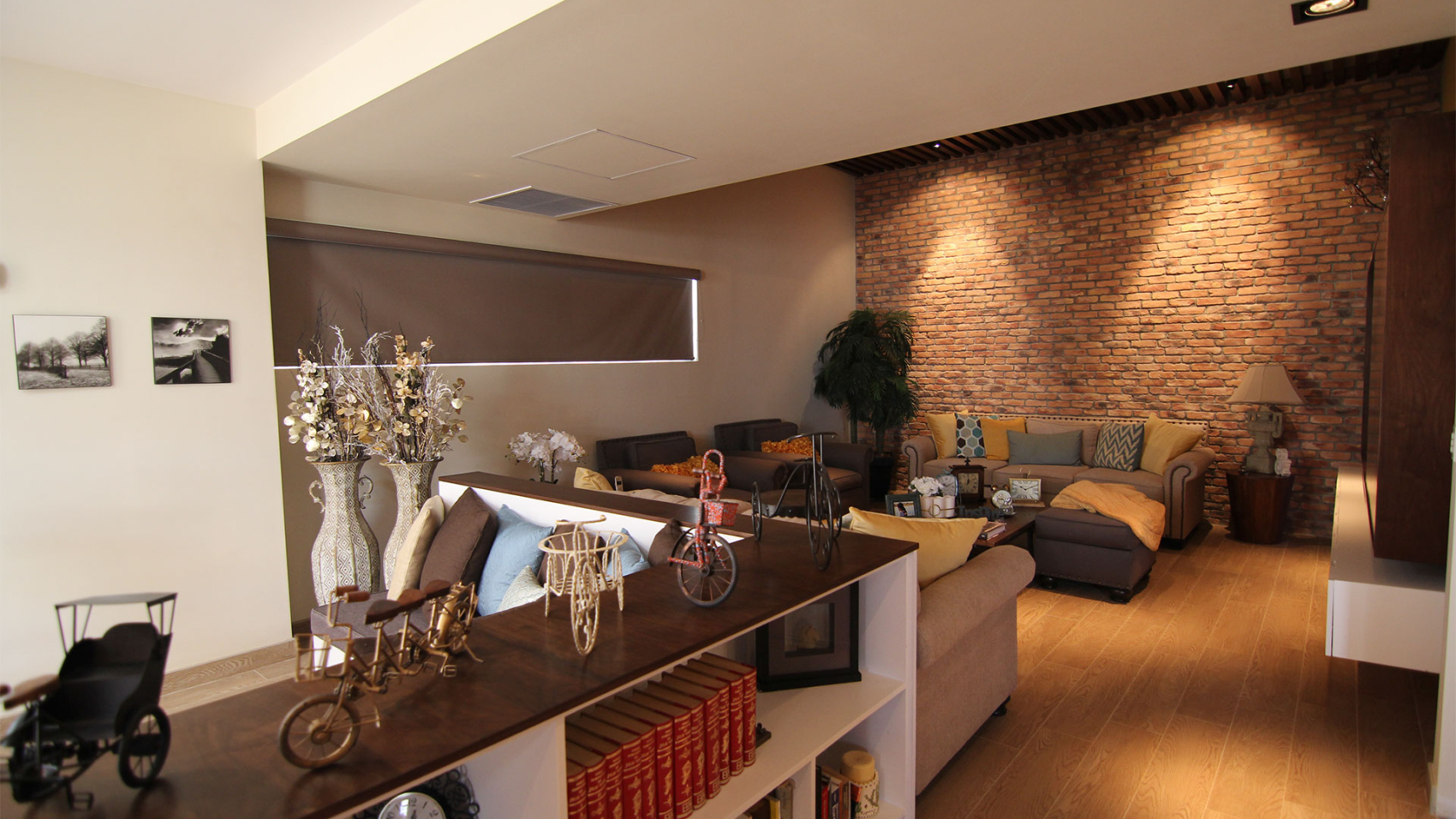
Not EVERYTHING has to be from the most expensive store, it is worth combining furniture, having the most important piece of space in the best place, and then placing accent pieces from one with more accessible prices, and hunting is completely worth it decorative elements in much more accessible stores like Marshalls or Home Goods, and if you really want to look for deals in Ross. Anything goes, investing 100 dollars in a decorative element is an exaggeration in my opinion, in a world where trends are so changeable, where today it is the latest fashion statement, but tomorrow it will not be. Invest in art, in the important piece, in a rug that lifts your space, an impressive chandelier, but NOT in the styling.

These are some of the ways in which I manage to maintain the integrity of the projects that we execute in the office, they are not infallible, there are some other clients that have escaped me and in the end they buy the $25 chairs, however in the In most cases, the design cycle is closed in a positive way, but above all, what has helped me a lot is being honest with the client about the costs, so that he, in turn, is also honest with me with the investment. and thus not work twice, and be all in the same channel when designing and executing.

LO

color-yellow-blog-lointerior-lorena-olmos

Color: Yellow

It was almost impossible for me to start talking about the emotions that a color carries and not start with the amazing -YELLOW- which is the basis for the image of The Inner. According to Eva Heller (2000), the color yellow is only the favorite of 6% of society, but I firmly believe that this percentage has been growing over time, I think that it has earned the affection of the public by being so versatile and full of life, especially in such a current gray, of course about 10 years ago yellow was not one of my favorite colors, and when I started to grow I understood the luminosity and magic of color, I guess it’s an acquired taste (like wine). Now this tone also brings with it a lot of controversy, because depending on what we combine it with, it can generate positive emotions (next to white, our vdia is full of luminosity and positivism), but with another type it can denote negative emotions (next to black it does shimmer gaudy and flashy). We can say that it contains a duplicity based on our tastes and moods. We know that it is a primary color, and within the colors it is the ‘lightest’, and when we mention yellow, we think of the Sun (Not in Luis Miguel, but in the radiant star in the sky), in the typical happy face of the nineties and luminosity, and when thinking of such positive analogies, why is it one of the least valued shades? Porque es un color sumamente variante, me explico: si lo combinamos con un poco de rojo, obtenemos el naranja, si le colocamos algo de azul, tenemos el verde. By creating this versatile character, it often takes a backseat in our minds. We can say that it is a color full of optimism, enlightenment, but at the same time you can be yellow with envy (because of bile), or think that it is a color that emits betrayal. At the end of the day it all depends on what you combine it with.

Vincent Van Gogh wrote the following about the light of the midi french “Everywhere there is a hue like sulfur, the sun rises to my head. A light that, for lack of better expressions, I can only say is yellow, pale sulfur yellow, pale lemon yellow. Yellow is beautiful.” I agree with my friend Vincent, yellow is beautiful, and in interiors it is a beautiful tool to use. I have mentioned several times in this article that yellow denotes the sun, luminosity, warmth, and it is important to know that artificial interior lighting can tend to go from bluish whites to yellows, and that if what we want to achieve is a light, welcoming and joyful environment, your answer without a doubt is to choose spotlights with this type of color.

The color yellow is daring, it is for those who are not afraid of it (if it is dressed in yellow, it is because it trusts its beauty) , and in interior design, it is a color with a challenge included, you can play with that aforementioned duplicity, if you saturate a space with yellow, you can create unparalleled luminosity, if you place it on the roof of a room, you will generate warm lighting , if you manage it on walls, it denotes joy, but everything, EVERYTHING is based on the combination. With the color that you combine, it is the emotion that you will generate in your space.

As in the article on obsession with color we talked about the chromatic circle, if I use this tool, and I look for the combinations that are handled as a rule, I get the following:

color-palette-casa-lirio-lointerior-lorena-olmos

Color Blanco

For all those who follow me on Instagram, you will know that I am in Northern Europe and as such, I have been surrounded by Scandinavian design, and an essential part of this style is to generate luminous spaces, to use white as a tool of design, so at this moment in my life where I am surrounded by simplicity and elegance caused mainly by the correct use of this color, it is how I select WHITE

I can name a myriad of adjectives to describe the color white,we associate it with themes of purity or innocence, goodness and clarity. Few people associate this color with something negative, it almost always manages to come into our lives in a positive way, it is the ying of the ying-yang, so we can name it the perfect color. And the obligatory question, white, is it a color? It is more than a color, it is the sum of all colors. For me, white is a Swiss army knife,a tool with multiple uses, but at the same time complicated to use, because with a little pigmentation, white loses its purity, and becomes malleable. Oyster white, burnt white, white with gray, beige white, it is important to know how to use its variables based on the function that we want white to perform in emotions. Personally, I like to use the ‘commercial White’ by PPG for ceiling lights, for me this color manages to create bright and open spaces, but on the wall, it must depend on the specific use of the space, what yes, is that I never choose ‘commercial White’for this, since we must understand that the walls are in continuous contact with users, and that it can look dirty very quickly, so the white to choose on walls must be different. My favorites for residential are ‘antique white’ , ‘prairie winds’, ‘garlic clove’ and ‘paraffin’, all from PPG. (Although this selection must be direct with your color palette to work correctly)

Now, painting is not the only way in which we can use color, if we touch on the subject of materials, we can talk about one of the current trends most used in recent years: ‘subway tile’, and specifically white has taken a big boost for bathrooms and kitchens. They are areas that can be considered “work” or activities in which lighting is of the utmost importance and, on the other hand, the cleanliness and openness that this element generates in the spaces, makes it an easy tool to use. We can also talk about marble or quartz, where choosing a white quartz as a cover can be a success in most cases, since more than a trend, it is a timeless element, and in cases where you are generating a considerable expense , it is important to take into account the lifetime. In terms of textiles, I never recommend it, it is a double-edged sword, because on the one hand it generates a luminous space, but on the other we are talking about continuous cleaning, and although the emotions that it causes us may be relaxing, the system cleaning is not so, so this is when those color pigments will not work so as not to choose a pure white and that the solution is to choose a white with some pigment based on our color selection, or in your case select some textile such as leather or vinipiel that are low maintenance.

But what emotions do you want to generate with the target?Everything depends mainly on the objective of our concept, however, the percentage to use of this color within our range is almost mandatory. Neutralizes and generates relaxing environments, as I mentioned before, it is a perfect color, and we must know how to use that perfection to make our user feel relaxed, at peace, in a harmonious and welcoming space. It is a maintenance color, it is essential to understand its pros and cons when proposing it, and how to propose it. Generating emotions is important, but functionality in my perspective is much more, and knowing the function behind the target is essential for our proposal to work, and this function will only be known by you when selecting a concept as a point of sale.

5-chairs-i-like-blog-lointerior-lorena-olmos

5 Chairs I Love

When we are studying the subject of anthropometry and ergonomics is taken, and you begin to know the background of the measurements of the human being, we begin this theoretical-practical class, which fills our minds with basic dimensions, logical knowledge that we have as users of spaces , but when it comes to designing, or placing on paper, they take a backseat due to the aesthetic part. For me, industrial design contains a high degree of difficulty, since they often design elements for daily use, where comfort is the determining factor, and the chair is a piece of furniture with which we designers can easily play, for what I leave here my 5 favorite chairs:

1- DSW-DSR- DAW

The wonderful couple of Charles and Ray Eames are responsible for creating endless innovative designs in the Mid-Century era, today in lia we can find their furniture in any space, which makes their designs recognized as one of the most timeless in my opinion With a career as an architect, Charles and Ray dedicated themselves to executing residential spaces for the most part, which allowed them to have continuous contact with their users and allowed them to capture what was necessary to create totally unique pieces that could be adapted to the multiple functions that are needed to home. Within his creations, my favorite series is one that for me is extremely versatile, which we can find as his plastic series. We can choose them by name, which tells us about the combination that describes the product:

DSR Dining (height) Side (chair) Rod (base)

DSW Dining (height) Side (chair) Wood (base)

DAR Dining (height) Arm (chair) Rod (base)

DAW Dining (height) Arm (chair) Wood (base)

What makes this chair one of my favorites is the fact that I can propose it in an office, in a house, indoors or outdoors, in different colors, with different materials, it is really a dynamic chair, the cost is not as high as others, which makes it really accessible. In my office, I have them as customer service chairs, but I have seen them in different spaces, in totally different modalities than mine, and they manage to turn the space around.

2- EGG CHAIR

Now the plastic series of the Eames had a dining room height, for its part the egg chair, is a lounge type chair, the height is different, so its use is also different, the previous one had that flexibility of use with which this chair does not count, however, what the egg chair does have is character, it is a piece of art, an accent chair for any space, which was the main objective of the architect Arne Jacobsen, who was commissioned he designed furniture for the Radisson Hotel in Copenhagen, Denmark. It reaches my top 5, since it is an iconic piece, extremely timeless but above all it is elegant, but that kind of classic elegance, like when one talks about Audrey Hepburn or Judy Garland.

3-MASTERS

In 2009 a chair was born in connection with a collaboration between Philippe Starck and Eugeni Quitllet for Kartell. Now, it is not the fact of the collaboration that is the most interesting thing about this product, it is the part in which this chair is a tribute, it is a tribute to Scandinavian design, to the Bauhaus and to the creations of the 50s. Philippe and Eugeni chose three iconic chairs: “Series 7” by Arne Jacobsen, “Eiffel Chair” by Charles Eames and “Tulip” by Eero Saarinen, and with the silhouettes they managed to give these ‘retro’ chairs a contemporary twist, never losing the essence of elegance and simplicity. It is not the first time that Philippe has dared to use a design from the past to incorporate it into the present, we also have the Ghost chair which I love, however, I think that the abstraction for the masters chair puts it in my top 5. The material, although it is made of plastic, is of high quality by Kartell, which makes it somewhat expensive, but it is worth it for its comfort and weather resistance. Different colors make it a versatile product, but what most catches my attention and amazes me is the level of functionality of the chair, it is the fact that it is stackable, giving the user the possibility of using it and keeping it safe. tip of your fingers.

4- OTTAWA

Created by the designer Karim Rashid, the Ottawa chair is part of a collection made for Bo Concept, and if you have the opportunity I invite you to get to know it, since it is one of the current collections that, for my taste, stands out in simplicity and elegance, but I will only talk about the chair for today. Karim lived in Denmark for a time, so Karim was inspired by this country, and chose nature as his muse, specifically the leaf for the seat and the legs of a bird. It is an elegant design where the subtlety of the lines manage to create a light element in sight, and that is extremely dynamic due to the versatility of its smooth lines. Bo Concept handles the product in different finishes and manages to accommodate any style that one is looking to achieve.

5- CH07 SHELL

Designed by Hans J. Wegner, for me it is a configured piece with impressive visual harmony. It is not the only magnificent work that Wegner managed to create, however in 1968 this piece was created, the public rejected it and failed to impress, so it went into the background and at the time it was reintroduced in 1998, it captured all our hearts, well not in 1998 for me specifically, but when I studied it in my master’s degree, I was surprised by the quality of the materials, the shape, but above all by the comfort. It is a lounge chair like the egg chair, and I think they use a similar language, however, I fell in love with this Danish design based on the stability and lightness it provides visually and tactilely.

I had to go back and forth on my top 5 about 4 times as I couldn’t rank them, or delete one because there are so many interesting nods I’d like to cover. I had the opportunity to visit the Danish Design Museum in Copenhagen, and it was impressive the amount of design that has been generated in the last 80 years, the visual ability to create unique pieces but above all functional things for the user. Obviously we all would like to have a designer piece in our spaces, but it is much more important to know the background of the purchase we are looking for, to try it, the style, the concept. My respect to all these designers and architects who have managed to polish good taste and create design icons.