For all those who follow me on Instagram, you will know that I am in Northern Europe and as such, I have been surrounded by Scandinavian design, and an essential part of this style is to generate luminous spaces, to use white as a tool of design, so at this moment in my life where I am surrounded by simplicity and elegance caused mainly by the correct use of this color, it is how I select WHITE
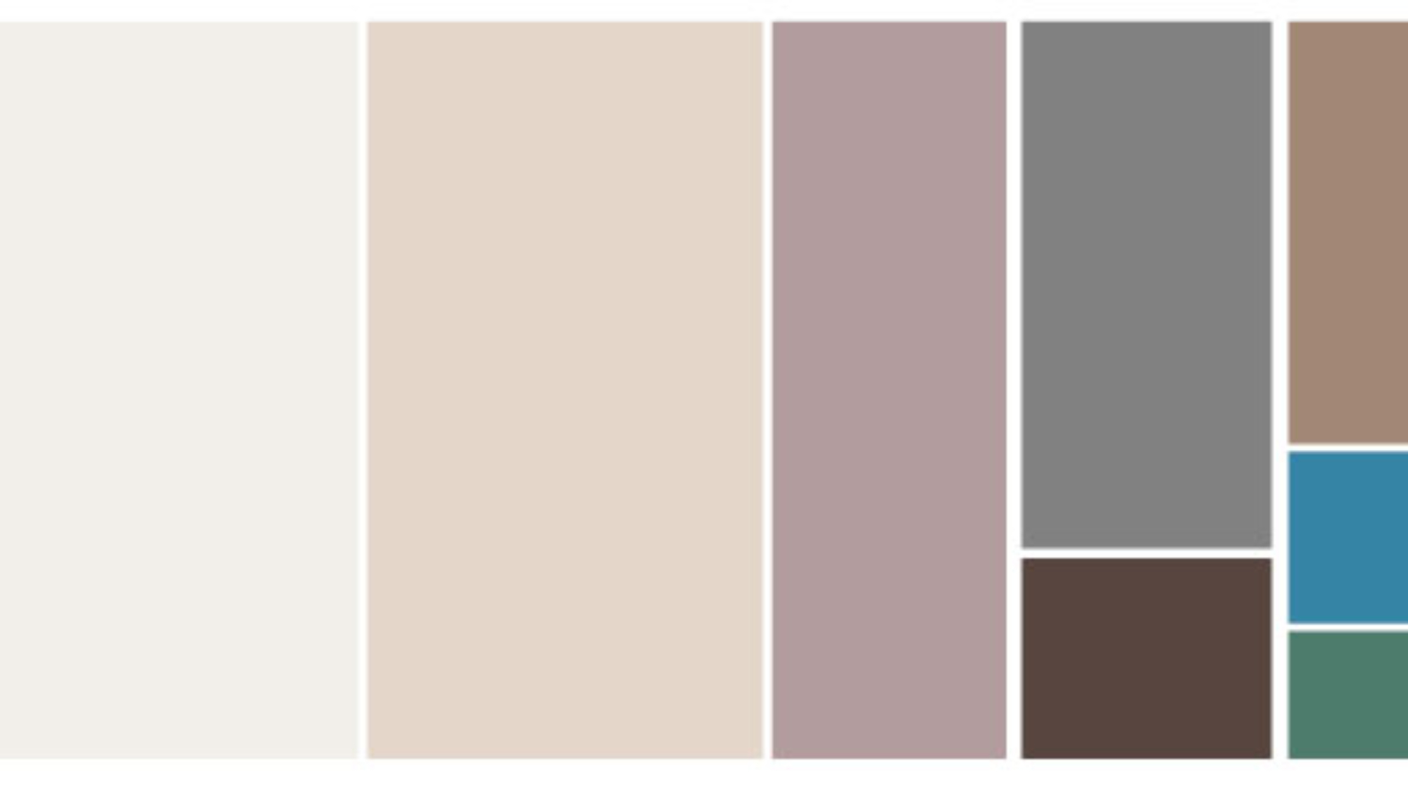
I can name a myriad of adjectives to describe the color white,we associate it with themes of purity or innocence, goodness and clarity. Few people associate this color with something negative, it almost always manages to come into our lives in a positive way, it is the ying of the ying-yang, so we can name it the perfect color. And the obligatory question, white, is it a color? It is more than a color, it is the sum of all colors. For me, white is a Swiss army knife,a tool with multiple uses, but at the same time complicated to use, because with a little pigmentation, white loses its purity, and becomes malleable. Oyster white, burnt white, white with gray, beige white, it is important to know how to use its variables based on the function that we want white to perform in emotions. Personally, I like to use the ‘commercial White’ by PPG for ceiling lights, for me this color manages to create bright and open spaces, but on the wall, it must depend on the specific use of the space, what yes, is that I never choose ‘commercial White’for this, since we must understand that the walls are in continuous contact with users, and that it can look dirty very quickly, so the white to choose on walls must be different. My favorites for residential are ‘antique white’ , ‘prairie winds’, ‘garlic clove’ and ‘paraffin’, all from PPG. (Although this selection must be direct with your color palette to work correctly)
Now, painting is not the only way in which we can use color, if we touch on the subject of materials, we can talk about one of the current trends most used in recent years: ‘subway tile’, and specifically white has taken a big boost for bathrooms and kitchens. They are areas that can be considered “work” or activities in which lighting is of the utmost importance and, on the other hand, the cleanliness and openness that this element generates in the spaces, makes it an easy tool to use. We can also talk about marble or quartz, where choosing a white quartz as a cover can be a success in most cases, since more than a trend, it is a timeless element, and in cases where you are generating a considerable expense , it is important to take into account the lifetime. In terms of textiles, I never recommend it, it is a double-edged sword, because on the one hand it generates a luminous space, but on the other we are talking about continuous cleaning, and although the emotions that it causes us may be relaxing, the system cleaning is not so, so this is when those color pigments will not work so as not to choose a pure white and that the solution is to choose a white with some pigment based on our color selection, or in your case select some textile such as leather or vinipiel that are low maintenance.
But what emotions do you want to generate with the target?Everything depends mainly on the objective of our concept, however, the percentage to use of this color within our range is almost mandatory. Neutralizes and generates relaxing environments, as I mentioned before, it is a perfect color, and we must know how to use that perfection to make our user feel relaxed, at peace, in a harmonious and welcoming space. It is a maintenance color, it is essential to understand its pros and cons when proposing it, and how to propose it. Generating emotions is important, but functionality in my perspective is much more, and knowing the function behind the target is essential for our proposal to work, and this function will only be known by you when selecting a concept as a point of sale.