It was almost impossible for me to start talking about the emotions that a color carries and not start with the amazing -YELLOW- which is the basis for the image of The Inner. According to Eva Heller (2000), the color yellow is only the favorite of 6% of society, but I firmly believe that this percentage has been growing over time, I think that it has earned the affection of the public by being so versatile and full of life, especially in such a current gray, of course about 10 years ago yellow was not one of my favorite colors, and when I started to grow I understood the luminosity and magic of color, I guess it’s an acquired taste (like wine). Now this tone also brings with it a lot of controversy, because depending on what we combine it with, it can generate positive emotions (next to white, our vdia is full of luminosity and positivism), but with another type it can denote negative emotions (next to black it does shimmer gaudy and flashy). We can say that it contains a duplicity based on our tastes and moods. We know that it is a primary color, and within the colors it is the ‘lightest’, and when we mention yellow, we think of the Sun (Not in Luis Miguel, but in the radiant star in the sky), in the typical happy face of the nineties and luminosity, and when thinking of such positive analogies, why is it one of the least valued shades? Porque es un color sumamente variante, me explico: si lo combinamos con un poco de rojo, obtenemos el naranja, si le colocamos algo de azul, tenemos el verde. By creating this versatile character, it often takes a backseat in our minds. We can say that it is a color full of optimism, enlightenment, but at the same time you can be yellow with envy (because of bile), or think that it is a color that emits betrayal. At the end of the day it all depends on what you combine it with.
Vincent Van Gogh wrote the following about the light of the midi french “Everywhere there is a hue like sulfur, the sun rises to my head. A light that, for lack of better expressions, I can only say is yellow, pale sulfur yellow, pale lemon yellow. Yellow is beautiful.” I agree with my friend Vincent, yellow is beautiful, and in interiors it is a beautiful tool to use. I have mentioned several times in this article that yellow denotes the sun, luminosity, warmth, and it is important to know that artificial interior lighting can tend to go from bluish whites to yellows, and that if what we want to achieve is a light, welcoming and joyful environment, your answer without a doubt is to choose spotlights with this type of color.
The color yellow is daring, it is for those who are not afraid of it (if it is dressed in yellow, it is because it trusts its beauty) , and in interior design, it is a color with a challenge included, you can play with that aforementioned duplicity, if you saturate a space with yellow, you can create unparalleled luminosity, if you place it on the roof of a room, you will generate warm lighting , if you manage it on walls, it denotes joy, but everything, EVERYTHING is based on the combination. With the color that you combine, it is the emotion that you will generate in your space.
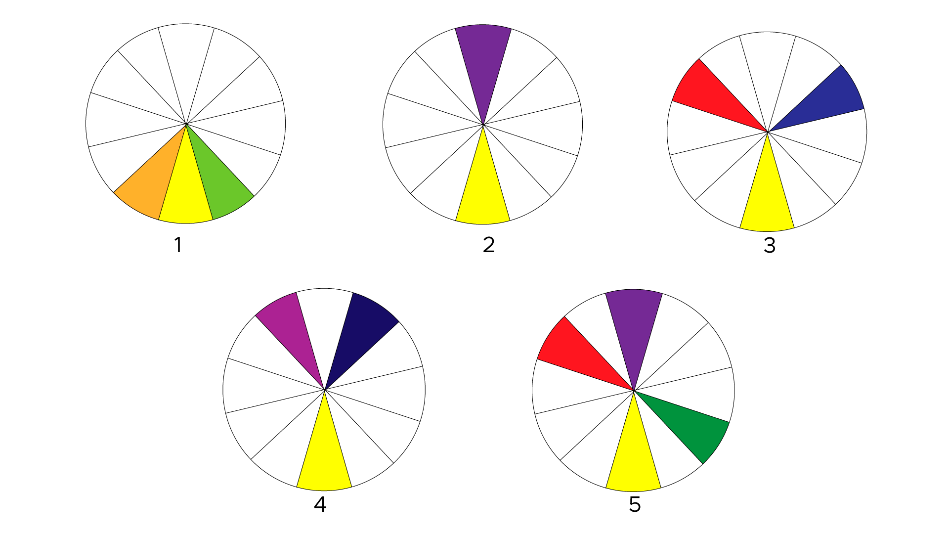
As in the article on obsession with color we talked about the chromatic circle, if I use this tool, and I look for the combinations that are handled as a rule, I get the following: